Sample
How we use the brand kit to move fast
A sample post assembled only with pieces from @arcasilesgroup/brand-kit: the same header, prose, code, photography and tables we would use to publish for real.
It is nine in the morning, the event has to be announced and the cover does not exist yet. Publishing fast is not writing fast: it is not deciding again what is already decided. The Arcasiles Group brand kit packages those decisions —color, typography, rhythm and components— so the page starts out speaking with the brand's voice. This post is a sample, and it is built from those same pieces.

Color is not chosen, it is inherited
No component carries a color by hand. The brand yellow #f9be4a is written into a token, not into a stray file, and every component reads it from the accent prop: change the emphasis color and the whole document repaints at once.
The same holds for the Events lila #674a98: it is not a value we copy from one slide to the next, but the very token that paints the meta pill, a callout's border and a list marker. The inline highlight proves it: the pill carries the color next to the hex, and the code text is set light or dark by its luminance.
Color is not chosen, it is inherited: it is written into a token, not a stray file. Change the prop and the whole document repaints at once.
From token to site, a single source
That yellow does not appear out of nowhere. It is declared once in the design-tokens —the canon of color, typography and rhythm—, moves on to the brand-kit, which turns it into components, and from the components down to every group site. Touch the canon and the kit updates. There is never a second copy to remember.
Assembling a post is placing pieces
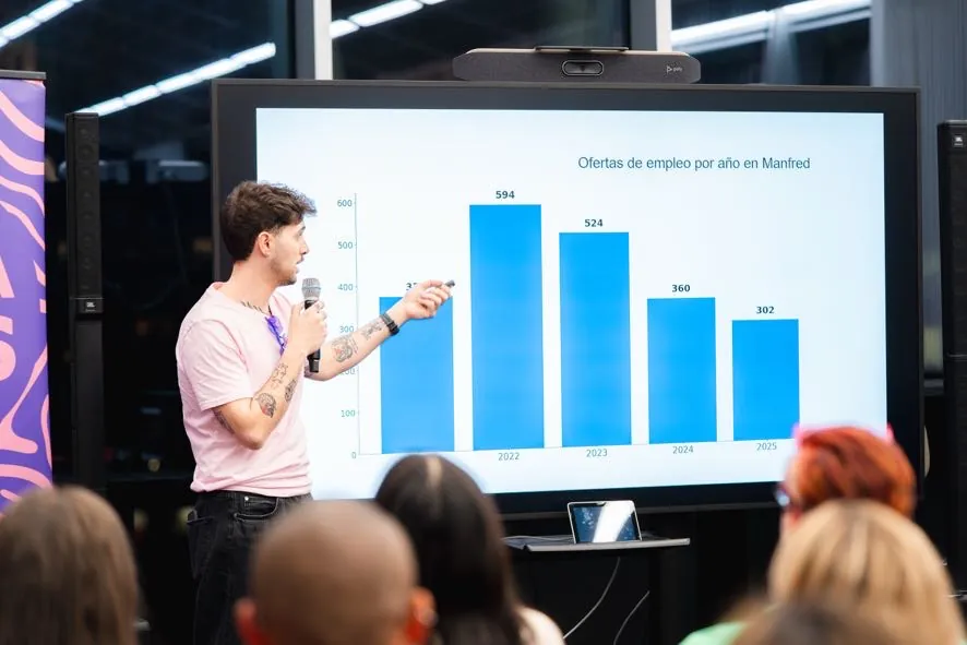
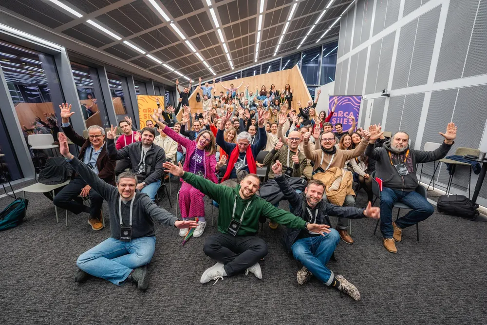
With that settled, assembling a post is placing pieces in order: a header, book-legible prose, a code block when it earns its place, a real event photograph and a close with related reading. No styling decision is ever made twice.

One piece, three formats
Color is not the only thing inherited: the whole component serves more than one place. A callout, a table or a header is built once and works the same on the open web, in an A4 document or in a 16:9 deck. Only the canvas around them changes.
What we gain by publishing this way
In practice, every post leaves us the same:
- Zero repeated styling decisions: color, typography and rhythm come from the canon.
- The same piece serves web, document and deck: it changes color with the prop, not with a copy.
- Accessibility by default: AA contrast, visible focus and dates as semantic <time>.
- From draft to published in minutes, because only the content changes.
Related posts
SAMPLE post with real group themes. Everything is built with the kit's pieces — PostHero, ReadingMeta, TableOfContents, RichText, HexToken, PullQuote, Figure, BlogDiagram, CodeBlock, PhotoGallery, BrandTable, Callout, BulletList and PostCard —; when publishing only text, photography and links change. Reading time, figures and dates render in Spanish: the kit formats them deterministically.