Components
The @arcasilesgroup/brand-kit library: buttons, badges, cards, charts and more.
The @arcasilesgroup/brand-kit package has 73 React components built on design-tokens.json v5.0.1, from Button to CtaBlock. They all read the CSS variables of the emphasis color in play, so they change color with no extra JavaScript. Here you will see 51 working, grouped by family; the remaining 22 are documented in their own chapters.
The kit in numbers
These figures are the Metric component doing real work: the data comes from the kit on every build, not from a mock.
Exported by @arcasilesgroup/brand-kit v5.0.1
One prop, seven colors to choose from
design-tokens.json, single source
The big number is set in BDSupperBold, the brand display face. It is reserved for figures and covers; body copy is always Lexend.
Actions
The Button with its six variants, and the Dialog that confirms before it runs. One primary action per surface; the rest step down the hierarchy.
Button
A pill (radius 100px) with a centered label; optional leading/trailing icon and a loading spinner.
The call to action: fires the primary intent of a view.
-
primary— THE action of the piece — one per surface. -
soft— secondary you want to stand out without stealing focus. -
outline— low-weight action on a light or dark (onDark) surface. -
secondary— the companion to a primary: 1pt neutral border; with onDark, border and text in white. -
ghost— tertiary and inline actions: text only, no border. -
dark— on a photo or a colored fill: solid #272727 with white text.
- default
- hover
- focus
- active
- disabled
- loading
- sm · 9pt
- md · 10.5pt (default)
- lg · 12pt
Use exactly one primary per surface and label it with a verb.
Don't place two primaries together or use the button as a status badge.
role=button, min-height ≥44px, 2pt blue focus ring, Enter/Space activate; Label in Name (WCAG 2.5.3).
| Prop | Type | Default | Description |
|---|---|---|---|
variant | primary | soft | outline | secondary | ghost | dark | primary | Visual weight and hierarchy of the action. |
accent | Accent | amber | Brand hue of the fill/border; emphasis only, never state. |
size | sm | md | lg | md | Control size (the hit-target stays ≥44px). |
onDark | boolean | Adjusts outline/secondary for dark surfaces. | |
disabled | boolean | Neutral gray; ignores hover and click. Never the brand color washed out. |
-
--arc-accent -
--arc-accent-text -
--arc-radius-badge -
--arc-duration
Dialog
The dialog buttons respond: try them.
A confirmation panel rendered STATICALLY open to compose inline.
- open (static)
Use it to compose confirmations in documents or previews; put actions in actions.
Don't expect a portal or open/close state: it manages no overlay or focus trap. Never use a color strip attached to only one edge of the card, panel or container: not top, bottom, left or right.
role=dialog with aria-label from the title; actions are real keyboard Buttons.
Feedback & state
Notices and badges: how things get labelled and how the system answers. Here color means something and the semantic tone sets it; the emphasis color stays out.
Badge
A flat pill (radius 100px) with uppercase Lexend 9pt text; no shadow, no focus.
A short flat-pill label: category or brand, not state.
- default
- live (role=status)
Use it to categorize; pass live only when it announces a dynamic change (a counter).
Do not make it focusable or a touch target: it is text, not a control. For something clickable there is the Button.
No role by default (span). With live → role=status + aria-live=polite. Not focusable.
| Prop | Type | Default | Description |
|---|---|---|---|
children
●
| ReactNode | The label text. | |
accent | Accent | amber | Hue of the fill + text; emphasis only. |
live | boolean | Turns it into role=status + aria-live=polite for dynamic changes. |
Required field
-
--arc-accent -
--arc-accent-text -
--arc-radius-badge
Callout
An 8pt box with a 1pt border; a left dot/icon, an optional 11pt/600 title and a 10.5pt body.
A highlighted notice in the flow: context, success, warning or error.
-
tone=info/success/warn/error— SEMANTIC system messaging. -
accent— brand emphasis: the background takes the color it is given and means no state.
Choose tone when it communicates state; accent when it only emphasizes.
Do not mix semantic tone and brand color in the SAME message. If the notice reports something use tone; if it only stands out, use the color. Never use a color strip attached to only one edge of the card, panel or container: not top, bottom, left or right.
Readable title + body; the icon is decorative (aria-hidden). AA contrast guaranteed per tone.
| Prop | Type | Default | Description |
|---|---|---|---|
children
●
| ReactNode | The notice body. | |
tone | info | success | warn | error | Semantic state: background at step 100 of the scale, border at 500, icon at 700. | |
accent | Accent | amber | Brand hue when there is NO tone (tint + border + dot). |
title | ReactNode | Optional title above the body. |
Required field
-
--arc-accent -
--arc-callout-bg -
--arc-radius-card
Forms
Data entry with real states: focus, helper, error and disabled. The emphasis color paints the focus; the error is always the danger red.
Input · Select · Checkbox
Input
Select
Checkbox
Input
A top label + a 6pt box with a 1pt border; below it, helper text or an error message.
Brand text field with label, helper and an accessible error state.
- default
- focus (accent border)
- helper
- error
- disabled
Always pair a label; use error for validation (paints danger red + message).
Do not signal an error with the brand color: the error is ALWAYS the danger red, with its message beside it.
label tied by id (useId), error with aria-invalid + aria-describedby, 2pt blue focus ring.
| Prop | Type | Default | Description |
|---|---|---|---|
label | ReactNode | Label tied to the field by id. | |
error | ReactNode | Validation message (danger red + aria-invalid). | |
helper | ReactNode | Helper text below the field. | |
accent | Accent | amber | Tints the focus border. |
disabled | boolean | Blocks input and lowers contrast. |
-
--arc-accent -
--arc-gray -
--arc-radius-metric
Select
Styled native dropdown with label, helper, error and disabled.
- default
- focus (accent border)
- helper
- error
- disabled
Give options with value/label; for a static preview use defaultValue.
Don't use it for 2 options (use Checkbox/segmented) or for actions.
native select → keyboard and screen-reader out of the box; label tied; error aria-invalid.
Checkbox
A single binary decision (accept, enable) with a clickable label.
- unchecked
- checked
- focus (accent)
- disabled
Use the label as the clickable area; control with checked+onChange.
Don't use it for immediate actions or to pick 1 of N (that's radio/Select).
native checkbox input, tied label, visible focus; disabled dims and blocks.
Data
Figures and series rendered on the server, zero JavaScript: the display metric, three SVG charts and the brand table. Colors come from the matching chartPalette.
Metric
A 6pt bordered card: a large BDSupperBold value, a label below and an optional gray caption.
Brand display figure (BDSupperBold) with its label: KPIs and covers.
Reserve it for the numbers that matter; give it the color of the section it sits in.
Don't use it for running text or numbers inside a sentence. Never use a color strip attached to only one edge of the card, panel or container: not top, bottom, left or right.
Value and label are real text (not an image); AA contrast with accent="ink" on light.
| Prop | Type | Default | Description |
|---|---|---|---|
value
●
| ReactNode | The display figure. | |
label
●
| ReactNode | What the number measures. | |
caption | ReactNode | Optional gray note under the label. | |
accent | Accent | ink | Text-safe color of the value. |
animate | boolean | Countup 0→value on mount (numbers only; reduced-motion skips it). |
Required field
-
--arc-accent -
--arc-font-display -
--arc-radius-metric
DonutChart
Split of a total into a few parts, as a server SVG.
Use 3–6 segments with their labels; colors come from the chartPalette.
Do not go past six parts, and do not use it for time series — LineChart is there for that.
SVG with accessible titles; color is not the only carrier (label + value).
BarChart
Compare discrete magnitudes across categories, as a server SVG.
Label each bar; sort by a criterion (magnitude or chronology).
Don't use it for parts of a whole (that's DonutChart).
Server-first SVG, no JS; axes and labels readable at AA contrast.
LineChart
Trend of one or more series over time, as a server SVG.
Name each series and pass them by props in chartPalette order.
Don't re-order the colors by hand or mix units on one axis.
Accessible SVG; each series is named — not told apart by color alone.
BrandTable
A data table with the brand typography and rhythm.
Give headers and rows; on narrow screens, let it overflow its container.
Don't use it for layout: it's tabular data, not a grid.
semantic table/th/td; the horizontal overflow is reachable with the keyboard too.
Content
The pieces a page or document is composed from: cards, prose, photography, partner belts and the brand closers. All server HTML.
BenefitCard
--arc-* variables and receive the color by prop, with no re-render. design-tokens.json v5.0.1: one single source for color, radius and motion. A numbered card listing one benefit or step.
Use in trios or grids for 3–4 benefits; number + title + body.
Don't cram long paragraphs: it's a summary, not an article. Never use a color strip attached to only one edge of the card, panel or container: not top, bottom, left or right.
Real heading per card; the number is decorative, the title carries weight.
CompareColumns
What Arcasiles brings
- Event brand and communication
- Community and outreach
- Content production
What the partner brings
- Venue and logistics
- Amplification on their channels
- Technical resources
Two facing columns: what A brings vs. what B brings.
Use it for agreements or scope comparisons with parallel items.
Don't add more than 2–3 columns or long asymmetric lists. Never use a color strip attached to only one edge of the card, panel or container: not top, bottom, left or right.
Each column has its title; semantic lists.
Diagram
Figure frame with a caption; inside, two facing sides (Compare) or a block with sections and marked sentences (Block).
Draw an idea with HTML and brand tokens — no screenshot, no loose PNG.
-
DiagramCompare— two versions face each other and color says which is which. -
DiagramBlock— a long text and the sentences worth looking at inside it.
Leave the conclusion to the caption: the drawing shows the shape, it doesn't argue it.
Don't use it as ornament or in place of a table: the bars say “there is text here”, never figures.
Labels are real text; filler bars are aria-hidden. The verdict never rides on color alone: each side also says it in words.
| Prop | Type | Default | Description |
|---|---|---|---|
before / after
●
| DiagramSide | The two sides of DiagramCompare: title, figure, quote, chips and verdict. | |
sections
●
| DiagramBlockSection[] | DiagramBlock sections, each with its lines and its marked sentence. | |
tone | "problem" | "good" | "neutral" | "accent" | "neutral" | What the color of a side says before you read it. |
caption | ReactNode | Figure caption. Without it the diagram renders unframed. | |
accent | Accent | Emphasis color for the subtree. |
Required field
-
--arc-accent -
--arc-accent-text -
--arc-danger -
--arc-green -
--arc-gray -
--arc-neutral-300
BulletList
- First list item with an ink dot
- Second item with the same visual mark
- Third item — the marker is neutral, never the emphasis color
A list with the brand marker: a black dot, never a colored one.
Use it for short enumerations; the marker is neutral by design.
Do not paint the marker with the emphasis color. If something needs to stand out, set the text in bold.
semantic ul/li; the dot is decorative.
Avatar
A circle (radius 100px) with initials derived from the name, or a cropped image.
A person's portrait or initials in three sizes.
-
name— derives initials from the name automatically. -
initials— explicit initials when there's no name.
- sm · 20pt
- md · 28pt (default)
- lg · 36pt
Pass name for automatic initials; pick the size by context.
Don't use it as a generic decorative icon: it represents a person.
Readable initials text; if it's an image, a descriptive alt.
| Prop | Type | Default | Description |
|---|---|---|---|
name | string | Name the initials are derived from. | |
initials | string | Explicit initials when there's no name. | |
src | string | Portrait image (cropped to the circle). | |
size | sm | md | lg | md | Avatar diameter. |
-
--arc-accent -
--arc-radius-badge
AccentLine
A 3pt line under a heading, in the emphasis color: the brand's punctuation.
- width via
widthprop
Use it under an h2/h3 to mark a section; it inherits --arc-accent-line.
Do not repeat it all over the block: one per section, and the rest is separated with space.
Decorative (adds no meaning); needs no alt text.
RichText
The group's identity rests on two gestures of color. The brand yellow, #f9be4a, lights up the decorative highlights —never the running text— and sets the rhythm of every page as a brand piece, not a manual.
Events answers with its lila, #674a98, which repaints badges, lines and charts without touching a single line of HTML. The pill carries the exact color next to the hex, and the text around it stays as readable as a book.
A long-prose container with a measure, line-height and book-like emphasis.
Use it for articles/descriptions; emphasis is by weight, not color.
Don't paint text yellow or exceed the reading measure.
45–75ch measure, 1.7 line-height; hierarchy via real headings.
HexToken
Color #f9be4a amber y #674a98 lila.
An inline pill with a hex and its color, to quote tokens in prose.
Insert it inside the paragraph; the code is set light or dark by its WCAG luminance.
Don't use it as a large swatch (use BrandPalette) or outside text.
The hex reads as text; the pill is decorative.
CodeBlock
A code block with highlighting, a title and a copy button.
-
lineNumbers— when line numbers matter (refs). -
maxHeight— to bound a very long block to a fixed height.
Pass lang for highlighting and locale for the button language.
Don't paste secrets or machine paths; it's public content.
Copy button with aria-label; the <pre> keeps the text for readers.
ServiceCard
Events
End-to-end production of corporate and community events.
- Event management
- Congress organization
- Team building
Marketing
Brand communication, from strategy to execution.
- Advertising
- Marketing
- Communication
Tech
Tailor-made technology for the event and the business.
- Tailor-made solutions
- IT & Cloud
- Data
Sample plan
The pricing variant: display price in the text-safe tone, period in gray and a pill CTA. The featured prop adds the black border and the “Recomendado” pill.
A service or plan card, with a highlightable pricing variant.
-
base— describes a service with features. -
pricing + featured— a plan with a price and a highlighted CTA.
Mark ONE plan as featured; the price uses the text-safe tone of the color.
Don't highlight several plans at once or invent rates. Never use a color strip attached to only one edge of the card, panel or container: not top, bottom, left or right.
Real heading; CTA is a Button/link with a ≥44px target.
CoverHero
A document cover: title, subtitle, recipient and band.
-
default— a light cover, with the band in color. -
accent + invertBand— a dark inverted cover (Tech).
Use it as the first page of proposals/documents.
Don't use it as a generic web hero (that's the site hero).
One h1 per document; AA contrast guaranteed by the band.
LogoStrip

A titled row of logos: partners or the group's own marks.
Use each brand's original files; give an alt per logo.
Don't recreate third-party logos or paint them a color that isn't theirs. Never use a color strip attached to only one edge of the card, panel or container: not top, bottom, left or right.
Each logo has alt; the title heads the strip.
LogoMarquee













An animated belt of logos that loops sideways.
- animated
- paused (hover/focus)
- static (reduced-motion)
Use it for many partners; it pauses on hover or keyboard focus.
Don't put reading text in the belt or animations that ignore reduced-motion.
aria-label describes the belt; with prefers-reduced-motion it's a static row.
SponsorTiers
- Logo on materials
- Opening mention
- Everything in Bronze
- Booth at the event
- Dedicated post
- Everything in Silver
- Sponsored talk
- Logo on stage
Sponsorship tiers with price and perks, one highlighted.
Order low to high; highlight the recommended tier with featured.
Don't invent real prices or highlight every tier. Never use a color strip attached to only one edge of the card, panel or container: not top, bottom, left or right.
Each tier has a heading; semantic perk lists.
TeamGrid

Name Surname
The role is set in the text-safe tone of the emphasis color, never in raw yellow: on light backgrounds yellow does not read.

Name Surname
Name in BDSupperBold and bio in 14px Lexend at 1.6 line-height — the whole card is server HTML.
Name Surname
With Instagram or LinkedIn present, the card adds SVG icon links above the WCAG touch-target minimum.
A grid of team cards (TeamCard): portrait, name and role.
Use real portraits, name and role; add socials with a ≥44px touch target.
Do not invent people or put the brand character in production: real portraits go here, with name and role. Never use a color strip attached to only one edge of the card, panel or container: not top, bottom, left or right.
Name in a heading; social icons with aria-label and touch target.
PhotoGallery
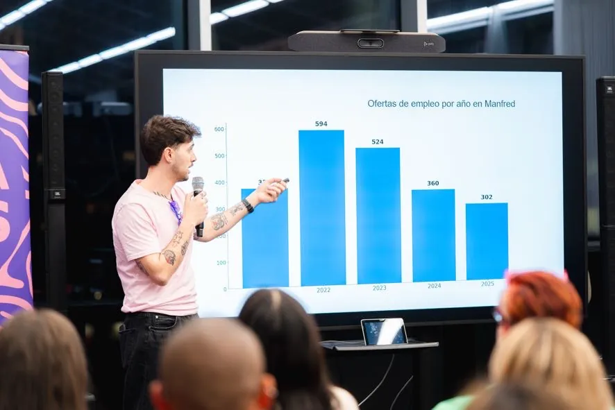

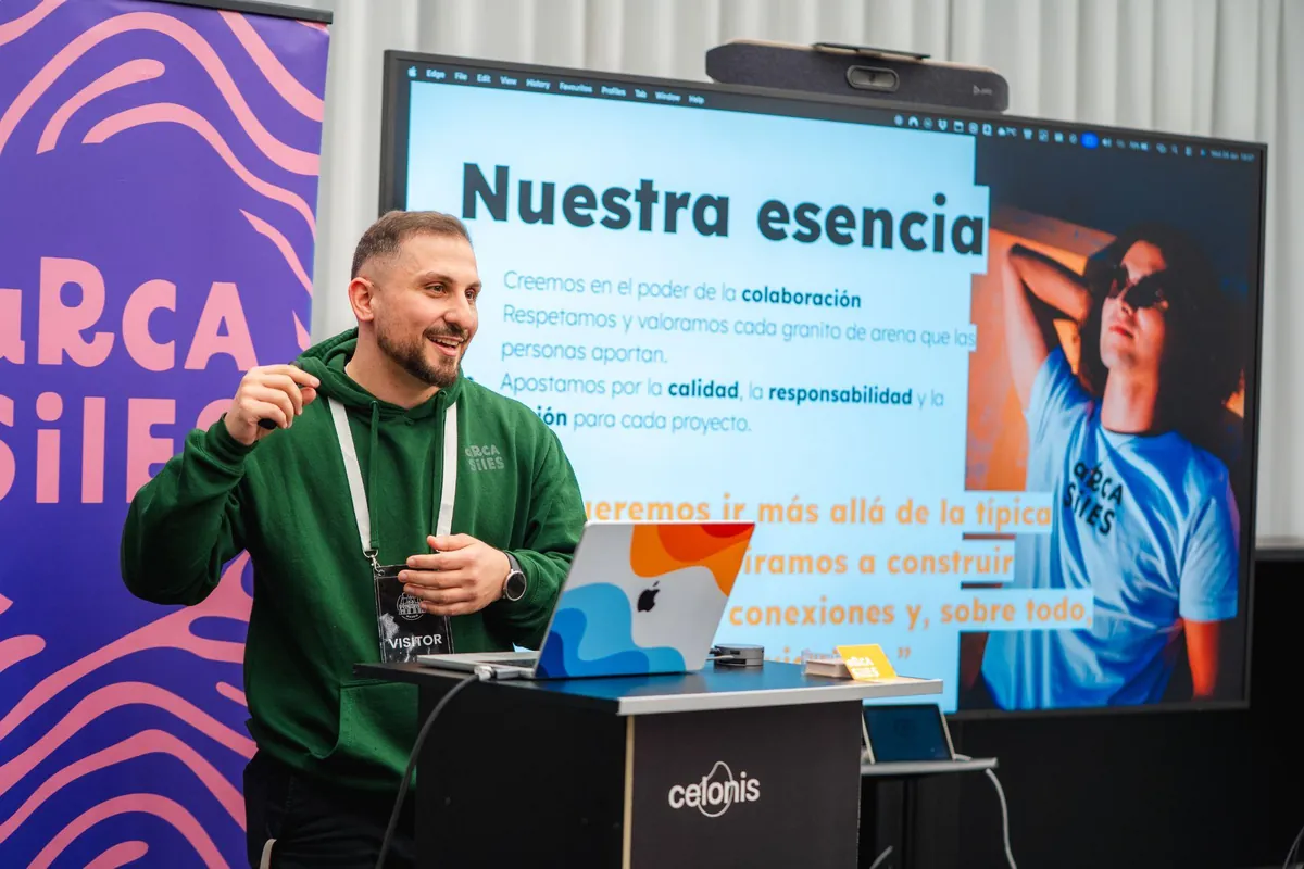
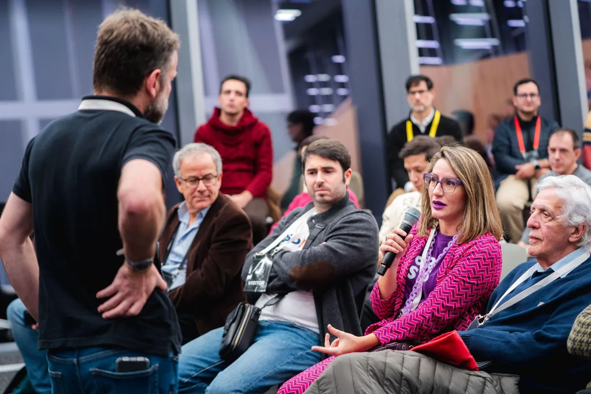
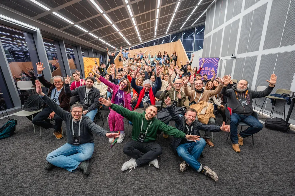
A dense photo grid with a caption and optional lightbox.
Use span to feature a photo; frame with position where the crop cuts faces.
Don't mix wildly different ratios or leave photos without alt.
Each photo has alt; the lightbox is keyboard-operable and closes on Escape.
BrandPhoto · PhotoBlock


BrandPhoto
One of the kit's six curated photos, with brand framing and radius.
Pick photo (charla/publico/qa/ponente/grupo/postevento); raise position if the crop cuts faces.
Don't use BrandPhoto for your own photos (use PhotoBlock).
Descriptive alt required; radius and framing by design.
PhotoBlock
Bounds YOUR OWN photo with the brand 8pt radius and an optional caption.
Use it for photos not from the kit; give alt and an optional caption.
Don't use it for the kit's six curated photos (use BrandPhoto).
alt required; caption as real text below the image.
SocialLinks
A row of the group's OFFICIAL social icons (verified glyphs).
- sm 16px
- md 20px
- lg 24px
Use the kit channels; the icons inherit the text color of the surface.
Don't swap them for emoji or unverified channel URLs.
Each link has the channel's aria-label, a 36px target (≥24px WCAG), rel=me.
BrandPalette
#272727
#afafaf
#e9e9e9
#f5f5f5
#faf9f7
#f9be4a
#7fbf80
#2797c4
#674a98
#e887a7
#da7835
#114F82
#7fbf80
#2797c4
#f9be4a
#b3362a
#114F82
A live reference of the palette: exact canon names and hex codes.
Use it to quote the brand color; it's reference, not decoration.
Don't re-declare hex by hand elsewhere: this is the quoted source.
Names and hex as readable text; not reliant on the swatch alone.
CtaBlock
| info@arcasiles.com | |
| Web | arcasiles.com |
A full-bleed document closer: ink background, logo and contact channels.
Use it as a proposal footer; put email and web in channels.
Don't use it as a mid-page banner: it's a closer.
AA contrast on ink; the channels are real text.
NavHeader
PageFooter
Events & blog
The group's agenda and blog: one data source as a card, a list, a calendar and a post. The kit never calls an API — it receives everything by props.
EventCards
Community meetup
The badge takes its color from the kit registry; the photo stays bounded and the CTA inherits that same color, with the text on top already computed by contrast.
Sign upArcasiles Community · Autumn networking
An open community gathering to close the season; seats are reserved on Luma.
Tech Talk · AI for event production
A technical talk with a live demo; sign up on Luma or follow it from LinkedIn Events.
Monthly community meetup
The open meetup every month; the call and the seats live on Meetup.
Arcasiles Day · Season wrap-up
We looked back on the season with the team and the community; the recap and photos are published.
Arcasiles Group · Season kickoff
Season kickoff with the whole group: quarter agenda and goals.
Tech Talk · Designing systems with AI
A technical talk with a live demo; seat on Luma.
Community projects fair
An open showcase of the season's projects.
Las Noches de Arcasiles · Live jazz
A jazz session from the night-time sub-brand.
EventCard
An 8pt card: optional cover on top, a color badge, title, date and place, and a pill CTA.
A single event's card: cover, color badge, date, place and CTA.
Give date, place and cta; frame the cover with imagePosition.
Do not invent events or call an API from here: the kit receives its data by props. Never use a color strip attached to only one edge of the card, panel or container: not top, bottom, left or right.
CTA with a ≥44px touch target; the badge only stands out, it does not report a state.
| Prop | Type | Default | Description |
|---|---|---|---|
title / date / place
●
| ReactNode | The event's base data. | |
accent | Accent | amber | Color of the category badge. |
cta / ctaHref | string | Button label + target. | |
image / imagePosition | string | Optional cover and its framing. |
Required field
-
--arc-accent -
--arc-radius-card -
--arc-radius-badge
EventCards
The same events as a card grid (auto-fit).
Reuse the SAME data source as EventList/EventCalendar.
Do not duplicate the agenda: one single data source, three presentations. Never use a color strip attached to only one edge of the card, panel or container: not top, bottom, left or right.
Each card has a heading; chips with icon + label.
EventList
Upcoming7 events
- Community
Arcasiles Community · Autumn networking
An open community gathering to close the season; seats are reserved on Luma.
- Tech
Tech Talk · AI for event production
A technical talk with a live demo; sign up on Luma or follow it from LinkedIn Events.
- Group
Arcasiles Group · Season kickoff
Season kickoff with the whole group: quarter agenda and goals.
- Tech
Tech Talk · Designing systems with AI
A technical talk with a live demo; seat on Luma.
- Events
Community projects fair
An open showcase of the season's projects.
- Music
Las Noches de Arcasiles · Live jazz
A jazz session from the night-time sub-brand.
Past1 event
- Season
Arcasiles Day · Season wrap-up
We looked back on the season with the team and the community; the recap and photos are published.
An agenda as a list grouped by status (Upcoming, Past).
Pass items with a status; the past one offers a “view recap”.
Do not shuffle the order: upcoming first, past after.
Chips ≥24px, CTA 44px; SVG icons with a label, never emoji.
EventCalendar
November 2026
- Group
- Tech
- Meetup
- Events
- Music
| Mo | Tu | We | Th | Fr | Sa | Su |
|---|---|---|---|---|---|---|
| 26 | 27 | 28 | 29 | 30 | 31 | 1 |
| 2 | 3 | 4 | 5 | 6 | 7 | 8 |
| 9 | 10 | 11 | 12 | 13Monthly community meetup | 14 | 15 |
| 16 | 17 | 18 | 19 | 20 | 21 | 22 |
| 23 | 24 | 25 | 26 | 27 | 28 | 29 |
| 30 | 1 | 2 | 3 | 4 | 5 | 6 |
Thursday, November 5
Thursday, November 12
Friday, November 13
Friday, November 20
Friday, November 27
A navigable monthly calendar with events as per-day pills.
- island (client)
- collapses to a per-day list on mobile
Pin month/year for the first render (SSR-stable); the browser resolves “today”.
Do not use new Date in render, it breaks SSR: pass the month and the year by props.
Semantic accessible table; ‹/› glyphs labelled; per-day list on mobile.
PostCard
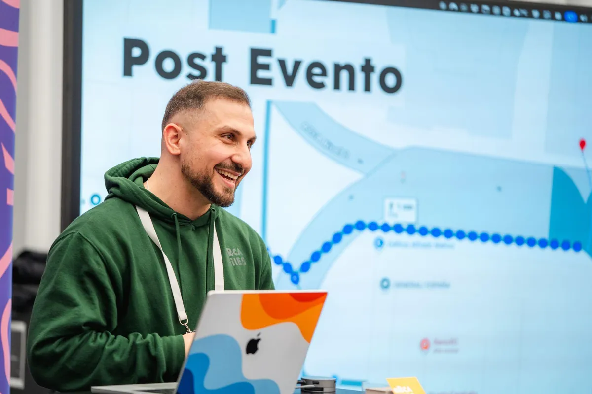
A blog-post card: optional cover, title, excerpt and meta.
-
with image— there's a cover (empty alt, decorative of the link). -
text-only— no cover: the text variant.
Link to the real post with href; PostMeta composes ISO date + author.
Do not put an h1 inside: the card title is an h3, and PostHero paints the h1 on the open post. Never use a color strip attached to only one edge of the card, panel or container: not top, bottom, left or right.
The whole card is a link; the date is an ISO <time>.
51 components live in this chapter, out of the 73 the kit exports. All of them read the same color prop, and none of them keeps a hex of its own.
The remaining 22 are not missing: they work in another chapter. Logo and SectionCard are in Logo, ColorSwatch in Color, Alcachofil in its own chapter, CodeBlock in MCP, and DocPage and SlidePage in Templates. SectionHeader and Heading compose these very pages.